Your Photos (2017-2024)

Status
Not open for further replies.
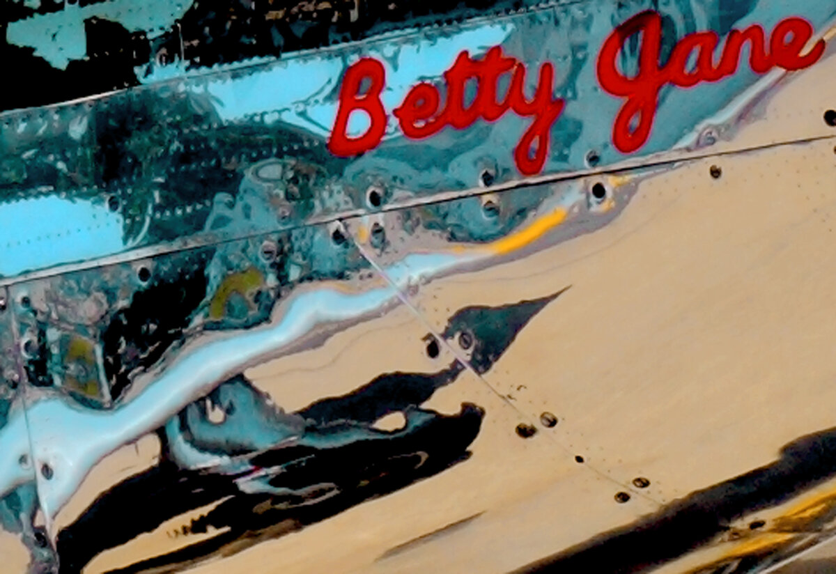
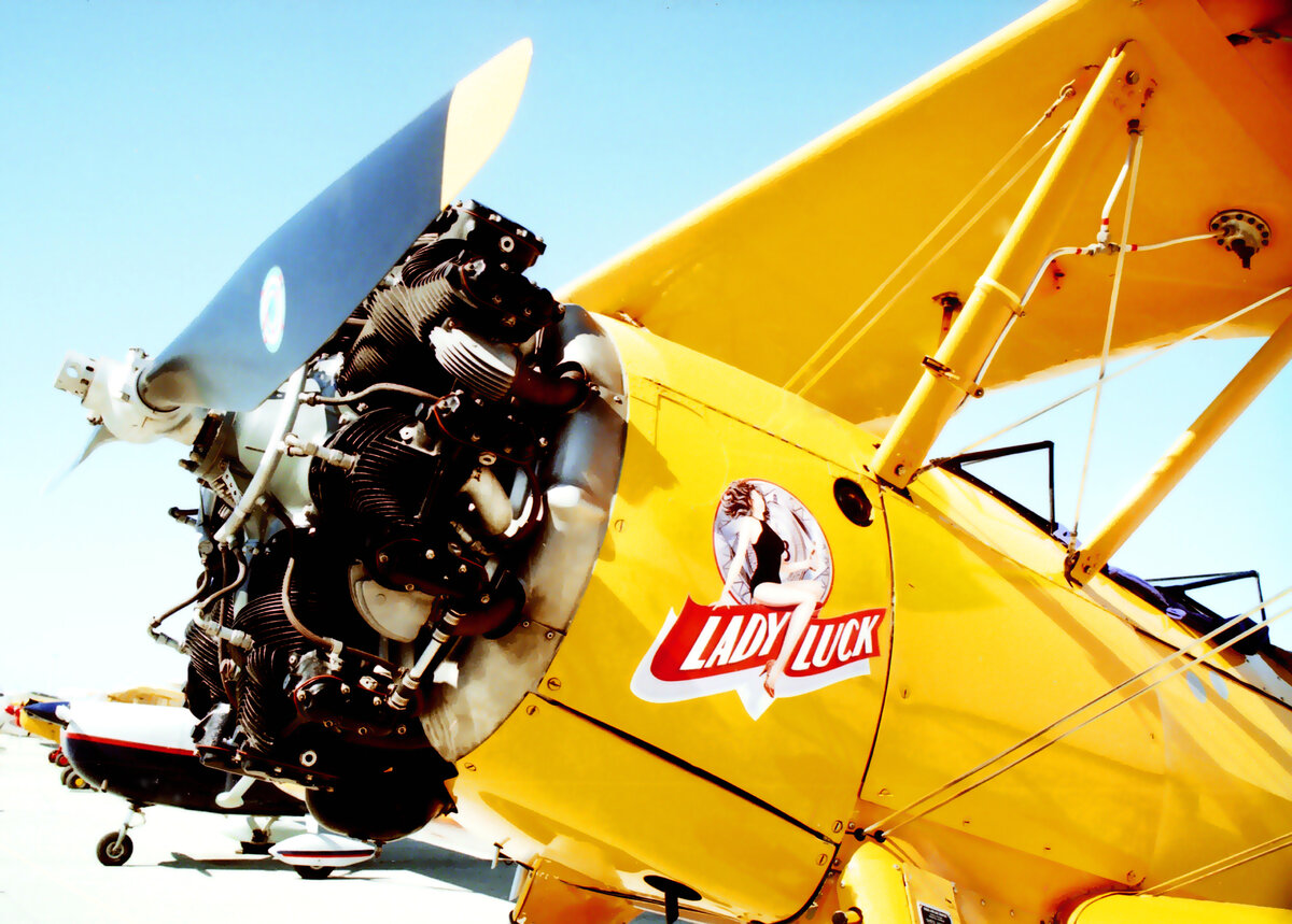
Aircraft nose art photos are examples of photographic minimalism. The entire object is not photographed, just a portion which highlights the nose art.

Watsonville Stearman 4.jpg


"Lucky Lady" Stearman bi-plane at Watsonville Air Show.

BettyJane.jpg


"Betty Jane" P-51 Mustang which appeared at a Blue Angles show at Moffett Field in Mountain View, CA

The thing that interests me with regard to photographic minimalism is that it lends itself well to evaluating Composition and the various ways to capture and direct eye motion and viewer interest in visual art. There are whole books written on the topic of composition, but none of them approaches composition from the angle of minimalism, especially as an aid in training the photographer's ability to visualize good full frame subject compositions.
 
I have in my previous posts chatted up Abstract Minimalism and Minimalism in general for photography. My intent was not so much to dump some of my photography into this thread, but to reveal more about my passions in photography. Photographic Abstract Minimalism and Minimalism are favorites, indeed, but both are directly related to my bent for Photographic Composition.

Photographic Composition is such a big topic for me to disclose and it seems better to reveal my Analytic pourings on this piece-meal and over time. That should keep me active in this thread.

For most people, Photographic Composition boils down to the 2/3rds Offset Golden Rule, some degree of Depth Recession and some degree of visual lines for eye tracking. And indeed, if folks know that much, it's a good thing. But there is so much more to composition in photography. I have long ago learned that good composition plays upon human cognition in perception - something that has been thoroughly studied in the world of Painting.

There's a long list of tricks to composition of visual imagery.

Here's a great book that can be downloaded from the web as a PDF...

Language of Vision by Gyorgy Kepes

The book can be rather terse, but if you muddle through it, it will enrich your photographic experience considerably.

If you'd like a much simpler, but less comprehensive read, ask me.

024.jpg


"Vortex" - an example of Photographic Composition using an offset subject and linear tracking, spatial recession plus texture and light contrasts.
 
Last edited:
  • Like
Reactions: mjd
As far as composition goes, product photography is very often center shot. The subject sits right smack in the middle of the frame with all background and foreground sacrificed to its visual presence. These center shot photos are the easiest and simplest form of composition. There's not much to say about it, except maybe, depth of field. That's not to say that all product photography is center shot. Oh no, gosh no. Banner shots, shots offset for text or human figures and shots that contain multiple product elements open the door to a greater dimension in composition.

One of the first and most important parts of a visual image composition is the entry or draw point. This is an area of the image where the viewer's perception is first attracted to and may typically be defined by a very high degree of contrast between the subject, background and foreground. Once the viewer has entered an image at this point, they are free to wander, but a good composition will provide guides to even this.

In a center shot composition, the entry point is obvious. As compositions become more complex, the entry point becomes more important.

Three Loves of The Aviation Mechanic.jpg


"Three Loves of The Aviation Mechanic" is a photo of mine taken on film at Kermit Weeks Aviation Museum in Lakeland, Florida, USA.

The entry point of the photo is obvious, the high contrast bright area around the mechanic's wife. From that point, the composition features what is nearly a 2/3 Golden Rule Offset. Note that offsets do not need to be 2/3rds of the image. That's a guide, not a strict rule. The photo also features quite a bit in the way of geometric linear directions. But the really subtle composition feature in this photo is what I term 'visual cuing'.

I first became acquainted with visual cuing when reading a written description of Leonardo Da Vinci's "The Last Supper." Each of the disciple's eyes gaze in different directions and the human response is to look to see where the disciple is looking. It is a subtle and subconscious thing. The viewer is cued to move their vision around the painting in this way.

In "Three Loves of The Aviation Mechanic", visual cuing is achieved by the direction in which the P-51 Mustang's are pointed, back toward the entry point and the mechanic's wife, who in turn, gazes up at the mechanic in one more example of cuing.

"Three Loves of the Aviation Mechanic" was a serendipity or opportunity photo. It was not posed and likely, the conditions for the photo will never occur again. Even a bad photographer can take a superior and splendid photo by serendipity and blind luck. But for good photographer's, the ability to visualize and capture such situations is a matter of training the eye, understanding the concepts of good composition.

As a last note, cropping a photo can improve composition to some extent, and "Three Loves of The Aviation Mechanic" was cropped from top and bottom.

This is about as good an intro to composition in imagery as I can provide. There is much much much more to it.

I use photographic minimalism to evaluate composition guides and train my vision. It has gotten to the point where I can easily pick out a serendipitous photo opportunity and for sure, have a great understanding regarding posed setups. Training visual perception and understanding composition are very important in that respect.
 
Last edited:
  • Like
Reactions: mjd
I'm going to close my expose' on My Photos with a couple last comments. First, I, like most people, love color photography. It is no accident that many people love sunset and sunrise photos, whether or not they take well composed photos or not. While it is true that I do a bit more than 'point and shoot', many people are totally satisfied with the colorful images they get when they point the camera and click the shutter. And what could matter more?

Color in visual arts has been explored by a number of early researchers and I could provide some reads on the topic, for anyone who wants to ask. There are a number of rules that have been established for contrasting, complimentary and tonal and tint modified Color. Color Harmony is something that has been well defined.

As I said, I love to play with color in photography and visual art ...

GardenDreamscape.jpg


"Garden Dreamscape" is a photo collage I did some time ago that was created from actual photos of growing plants. That's quite a salad, isn't it?

The final point I want to comment on regarding 'My Photos' is the concept of images as language. Language is something that most people associate with thoughts put out or taken in as words, sentences and streams of talk, chat and text. For some time, historically, there has been a movement to define images as a unique language in themselves. This spans everything from signage, advertisements, paintings, drawings and photographs to films and movies. And who can deny that they have heard that photographs should have a subject and make a statement? And who can deny that a film tells a story?

Images as language is a fascinating topic to read up on, if you haven't already. And I try in my photography to apply the image as language concept and let my photos speak. It's an ultimate in compositional expression.
 
Last edited:
The last thing I like to do with images and visual art is digital drawing.

PodRacer.png


"Pod Racer" - a tracing of actual Star Wars art.

If you take a course in digital drawing using Adobe Illustrator, Affinity Designer or Corel Draw, you usually start out by making tracings.

Tuning Peg Winder 3D.png


"Tuning Peg Winder" - a drawing done with Adobe Illustrator.

Eventually, you develop the digital skill to do your own drawings.

I have invested in a Wacom Cintiq 22 Creative Pen Display Tablet to make my drawing more effective.

Can you use drawing to enhance your food photography? Certainly.
 
Last edited:
Status
Not open for further replies.
Back
Top Bottom