Clarity of Hyperlinks

Which do you prefer?


  • Total voters
    11
84360

84362

84364


(I have cheated a little here so you'll see all the green except oddly signatures, is changing. It was the easier way of changing it because I don't have to code to show the differences)

One other option available is that internal links - such as links to recipes in the challenge thread remain green (current colour) and external links are red.
This could be done so that members choose to select this colour profile whilst the default remains as it has been for about 7 or 8 years.

84365


All of these options are available for members to trial. Just find to Style chooser at the bottom of the screen and click on it

84366

and select the option you want.
Note currently you can't have CB set to full width on large screens and change the hyperlinks.
84367
* indicate options members can choose. The rest are my play/trial areas so I can mess up and no-one know!
 
I prefer the "underline" if only because It is in line with the majority of the websites (including my own) that I use. But if it's any bother, I'll vote for "no change".
 
kaneohegirlinaz Morning Glory How is a darker green going to make a hyperlink more visible? I'm just curious because I don't understand how they'll be clearer to members if they are closer in colour to the normal text. Right now all the greens on the site are 1 of 3 shades add the text is the darkest of those 3.

I think you are right it doesn't really help having looked at the examples. The lightest green actually shows up better I think.
 
I think you are right it doesn't really help having looked at the examples. The lightest green actually shows up better I think.
I found a way of not having to repeat all the site settings in future but give members the option to either stay as it is, underline, or go bold and one that can actually change external links to red (CB links stay green). You may need to talk members through changing over even though I've put up how to change the style settings... (bedtime here). So everything with a red * is an option a member can choose to change to now if they want to.
 
Well, I've tried the style options but unfortunately the site kept crashing until I reverted to default. The red is very bright! From an aesthetic point of view I'd suggest an orangey colour rather than red as it complements the green. This sort of colour but possibly a bit darker.
 
Well, I've tried the style options but unfortunately the site kept crashing until I reverted to default. The red is very bright! From an aesthetic point of view I'd suggest an orangey colour rather than red as it complements the green. This sort of colour but possibly a bit darker.
I can try the word Orange and see what it gives. The colour is literally "red" in the coding, not a rbg 6 digit code.

I'm more concerned about the "crashing". I've not had that on either device I've tried at all. I've had the odd site not available, reload but I get that all the time on satellite bb and worse in bad weather which today was.
What're the symptoms (best in moderators forum please and I'll look at it in the morning)
 
Yeah, might have to work on the "Orange".... this is it with the coded word "Orange" instead of red. It's rather bright.

84394
Darkorange gives this.

84396

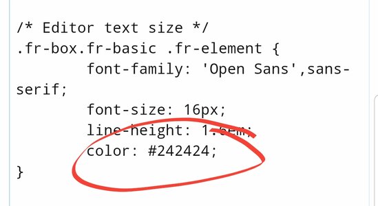
Morning Glory do you have the rbg code or the preferably the # code for that orange please? I have to code either by a dedicated value such as red, orange, yellow which are all predefined it by # code such as below

84395
I'll be converting the rbg code to a hex code.
 
Last edited:
I'm fine with it the way that it is, although if it were a bit darker green ... I catch the links as my mouse hoovers over the text, so there's that ...
I don't hover my mouse over the text, unless I see a hyperlink I want to click. It stays on the scrollbar.

I think a darker green would be good for hyperlinking. I've missed things in the past.

Okay, seeing dark and light and regular green in action above - lighter green would work best.
 
Last edited:
I'm wondering if we need a new colour at all if we have the underline option. I think everyone should be able to see the links easily if they choose the underline option. I've set my 'style chooser' to underline at the moment and don't find it as 'disruptive' as I first thought.

Any thoughts from those members who find the usual green (no underline) an issue?
Well if not everyone does it, I'm going to continue missing things. And it's likely that some will not do it, so...it's gotta be all or none. Oh well.
 
Back
Top Bottom